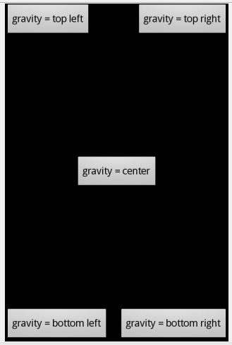
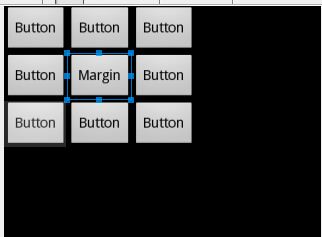
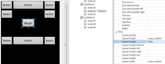
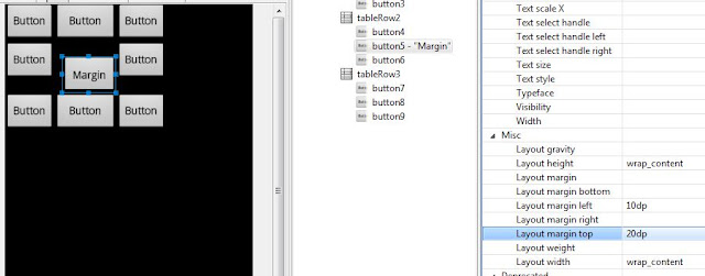
LinearLayout - displays View-elements as a single row (if it is Horizontal) or a single column (if it is Vertical). I used it in the previous lesson, when demonstrating usage of layout-files during screen orientation change.
TableLayout - displays elements in the form of a table, with rows and columns.
RelativeLayout - each element’s position is configured relatively to other elements.
AbsoluteLayout - each element is specified an absolute position on the screen in the coordinate system (x, y)
Lets observe these types
READ MORE:
- ANDROID TRAINING IN KATHMANDU
- ANDROID TRAINING IN LALITPUR
- APP DEVELOPMENT IN KATHMANDU
LinearLayout (LL)
This type of a ViewGroup is set as default when creating new layout-files. It is really convenient and flexible enough to create screens of different complexity. LL has an Orientation property, which defines how will the child elements be positioned - in a vertical or horizontal line.
Let’s make a simple and clear example.
Create a project:
Project name: P0061_Layouts
Build Target: Android 2.3.3
Application name: Layouts
Package name: ru.startandroid.develop.layouts
Create Activity: MainActivity
Open main.xml layout-file and place the following code inside:
<?xml version="1.0" encoding="utf-8"?>

<LinearLayout

 xmlns:android="http://schemas.android.com/apk/res/android"

 xmlns:tools="http://schemas.android.com/tools"

 android:layout_width="match_parent"

 android:layout_height="match_parent"

 android:orientation="vertical">

</LinearLayout>
Now we have a LinearLayout with vertical orientation as a root element.
Drag three buttons from the left to the root LinearLayout. They are positioned horizontally.
Now change Orientation property to horizontal for LL in Properties and save (CTRL+SHIFT+S) - buttons are positioned horizontally
A ViewGroup can be inserted into another ViewGroup. Let’s place two other LL into one. Delete all the elements from main.xml (three buttons) except of the root LL. Specify vertical orientation for the root LL and add two new horizontal LL inside it. They are located in the Layouts section in the list of elements on the left. Let me remind you, that you can drag and drop elements from the list not only to the screen, but also to the specific element in the Outline tab.
Add three buttons inside each horizontal LL. Now we have got two horizontals rows of buttons.
TableLayout (TL)
TableLayout consists of rows TableRow (TR). And each TR contains View elements that form columns. So the number of Views in TR is a number of columns. But the number of columns in a table must be equal for all rows. That’s why, when different TRs have different numbers of View-elements (columns), the overall number of columns is defined by the TR with the maximum number. Let’s observe an example.
Create layout-file tlayout.xml with TableLayout as a root element.
Add three TableRow rows into the root TableLayout (from Layouts section on the left) and add two buttons into each row. The result: our table has got three rows and two columns.
Add a few more buttons to the first row. The number of columns now equals 4, as it is defined by the row with the maximum number of elements and it is the first row in our case. For the second and the third rows the third and the fourth columns are empty.
Add a TextView and a Button to the second row and make text in the added TextView empty. Do the same with the third row. We can see that these elements are now placed in the third and the fourth column. And because TextView is empty and not seen on the screen, it seems like the third column in the second and third rows is empty.
The width of the column is defined by the widest element in this column. Enter some text into one of the TextViews and we can see that it has made a column wider.
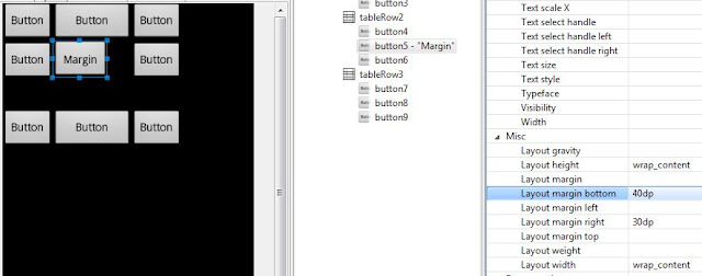
Now I will remove elements of the fourth column and build a screen like this. Try to do it on your own as an exercise.
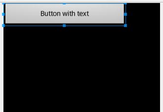
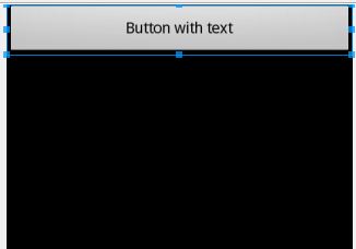
TL can contain not only TRs, but also simple Views. For example, add Button just into the TL, not into TR and you will see how it stretches to the width of the whole table.
RelativeLayout (RL)
In this type of Layout, each View-element can be positioned in a specific way relatively to the specified View-element.
Types of relationships:
1) to the left, right, above or below the specified element (layout_toLeftOf, layout_toRightOf, layout_above, layout_below)
2) aligned by the left, right, top or bottom edge of the specified element (layout_alignLeft, layout_alignRight, layout_alignTop, layout_alignBottom)
3) aligned by the left, right, top or bottom edge of a parent (layout_alignParentLeft, layout_alignParentRight, layout_alignParentTop, layout_alignParentBottom)
4) centered vertically, centered horizontally, centered vertically and horizontally relative to its parent (layout_centerVertical, layout_centerHorizontal, layout_centerInParent)
More details are available in help.
Create rlayout.xml and copy and paste this xml-code:
<?xml version="1.0" encoding="utf-8"?>

<RelativeLayout

 xmlns:android="http://schemas.android.com/apk/res/android"

 android:layout_width="match_parent"

 android:layout_height="match_parent">

<TextView

 android:id="@+id/label"

 android:layout_width="match_parent"

 android:layout_height="wrap_content"

 android:text="Type here:">

</TextView>

<EditText

 android:id="@+id/entry"

 android:layout_width="match_parent"

 android:layout_height="wrap_content"

 android:layout_below="@+id/label"

 android:background="@android:drawable/editbox_background">

</EditText>

<Button

 android:id="@+id/ok"

 android:layout_width="wrap_content"

 android:layout_height="wrap_content"

 android:layout_alignParentRight="true"

 android:layout_below="@+id/entry"

 android:layout_marginLeft="10dip"

 android:text="OK">

</Button>

<Button

 android:layout_width="wrap_content"

 android:layout_height="wrap_content"

 android:layout_alignTop="@+id/ok"

 android:layout_toLeftOf="@+id/ok"

 android:text="Cancel">

</Button>

</RelativeLayout>
RelativeLayout is a the root element here.
We will get such a screen:
We are interested in xml-code. I will now shortly describe unknown attributes and their meanings:
android:layout_width="match_parent"
android:layout_height="wrap_content"
android:id="@+id/entry"
- the android word in the name of each element is a namespace, I will omit it in the explanations.
- id - the element ID,
- layout_width (the width of the element) and layout_height (the height of the element) can be specified in absolute values or can be the following: fill_parent (maximum available width or height in the bounds of its parent) and wrap_content (width of height is defined by the content of an element). Help states that there is also match_parent. It is the same as fill_parent. For some reasons, developers of the system decided that match_parent name is more convenient and they will stop using fill_parent soon. For now, it’s left for compatibility. So remember that match_parent = fill_parent and we will be trying to use match_parent further. Later we will stop on this and analyze it in more detail.
Now let’s get back to our elements. In the example we can see a TextView, EditText, and two Buttons - OK and Cancel. Let’s look through the attributes we are interested in.
TextView
android:id="@+id/label" - ID
android:layout_width="match_parent" - occupies all the available width (even though, it’s not visible on the screen)
android:layout_height="wrap_content" - height defined by the content
it is not related to anything
EditText
android:id="@+id/entry" - ID
android:layout_width="match_parent" - occupies all the available width
android:layout_height="wrap_content" - height defined by the content
android:layout_below="@id/label" - located below the TextView (reference by ID)
Button_OK
android:id="@+id/ok" – ID
android:layout_width="wrap_content" - width defined by the content
android:layout_height="wrap_content" – height defined by the content
android:layout_below="@id/entry" - is located below EditText
android:layout_alignParentRight="true" - is aligned by the right edge of the parent
android:layout_marginLeft="10dip" – has a margin on the left (for Button_Cancel not to be adjacent)
Button_Cancel
android:layout_width="wrap_content" - width defined by the content
android:layout_height="wrap_content" – height defined by the content
android:layout_toLeftOf="@id/ok" - located to the left of Button_OK
android:layout_alignTop="@id/ok" - aligned by the top edge of Button_OK
You can add some more elements and experiment with their locations.
Pay your attention, that a View element can have no ID (android:id). For example, it is not usually needed for a TextView, because most of the times they are static and we rarely refer to them in the application. EditText is different - we work with the text field content, and a Button - we need to process clicks and to know exactly which Button has been pressed. In the future, we will see one more reason to specify an ID for a View-element
AbsoluteLayout (AL)
Provides absolute positioning of elements on the screen. You specify the coordinates for the left top corner of the component.
Create alayout.xml with AbsoluteLayout as a root element
Now try to add different elements by dragging them to the screen. They are not aligned as in LinearLayout or in TableLayout, but placed where you dragged them. So it is absolute positioning.
Open xml-code and note that for specifying coordinates layout_x and layout_y properties are used
<?xml version="1.0" encoding="utf-8"?>

<AbsoluteLayout

 xmlns:android="http://schemas.android.com/apk/res/android"

 android:layout_width="match_parent"

 android:layout_height="match_parent">

<Button

 android:id="@+id/button1"

 android:layout_width="wrap_content"

 android:layout_height="wrap_content"

 android:layout_x="42dp"

 android:layout_y="62dp"

 android:text="Button">

</Button>

<TextView

 android:id="@+id/textView1"

 android:layout_width="wrap_content"

 android:layout_height="wrap_content"

 android:layout_x="142dp"

 android:layout_y="131dp"

 android:text="TextView">

</TextView>

<CheckBox

 android:id="@+id/checkBox1"

 android:layout_width="wrap_content"

 android:layout_height="wrap_content"

 android:layout_x="55dp"

 android:layout_y="212dp"

 android:text="CheckBox">

</CheckBox>

<RadioButton

 android:id="@+id/radioButton1"

 android:layout_width="wrap_content"

 android:layout_height="wrap_content"

 android:layout_x="171dp"

 android:layout_y="318dp"

 android:text="RadioButton">

</RadioButton>

</AbsoluteLayout>
First you might think that this is the most convenient and intuitive method of placing elements on the screen - they are placed wherever you want at once. But this is only in the case when you develop for the screen with a specific resolution. If you look at such application on the other screen, all the elements will be shifted and their positioning will be different from what you have planned. That’s why it is not recommended to use this Layout. And it’s compatibility with future Android versions is not guaranteed.